ODS - The Organizational MRI

ODS Articles
(ODS = Organizational Diagnostic System)

Overview

An Organizational MRI (scorecard)
For the Human Side of Enterprise

What gets measured
Organizational Performance Groupings

Easy To Understand Reports
How to Interpret Report Scores

Case Study
How ODS Improved Organizational Capacity to Perform

Research - Validation
Behind the ODS Measurement System

Executive Focused Information
How Executives Use ODS Reports


Creating Meaningful Measures

WSA Canada Solved the Problem of Confusing Scores

ODC Expanded Graphic HI LOW GRAPHIC

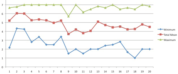
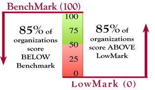
The above chart shows how confusion is created.

When the range of response for different companies varies with the question, it is hard to make a meaningful conclusion

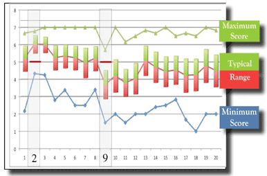
The above chart shows the variation of scores for different questions:

  • The maximum score achieved by any company
  • The average score achieved by all the companies
  • The lowest score received by any company

This article identifies how the ODS data is reported so companies can make meaningful comparisons ofx their own performance to other companies.

Meaningful Measures Compare You to Other Companies

How WSA Canada Created Meaningful Measures


Hard Meaningful Measures
to Drive Improved Organizational Performance

Details


Meaningful Measures Compare You of Other Companies

The WSA Organizational Diagnostic System compares one company's scores to a database of other companies. The above chart shows that a comparison to other companies is the only way to get a meaningful measure. For each question, the average of all companies varies from 3.8 to 7 on a 7 point scale. This means a score of 5 can be way above or well below averge.

This article identifies how the ODS data is reported so companies can make meaningfully compare their own performance to other companies.


How WSA Canada Created Meaningful Measures


BenchMarks and LowMarks

After extensive statistical testing, WSA identified a separate normal range for each question. Company scores are reported compared to the range. In this range:

  • 100 = scoring better than 85% of companies
  • 50 = scoring average
  • 0 = scoring worse than 85% of all companies
  • Most companies score within this range


Benchmark vs Lowmark

Range

Meaningful Measures - Easy to Understand

The chart on the left shows how each survey question has a different “Maximum” and “Minimum” score and a different score range in which most (70%) companies have responded. Now understanding scores is easy. Instead of typical survey numbers which are very difficult to interpret your scores are compared to the normal response range.

For example, a score of 5 might be a good score (question 9) or a poor score (Question 2). Now instead of looking at your score number WSA compares you to the range. The result is a meaningful organizational diagnostic,

This simple way of displaying the data enables a meaningful organizational diagnostic process to begin.

Easily Identify Current
Competence and Improvements

The chart to the right shows a clear need for improvement (the blue bars) and substantial progress after 2.5 years of development effort (the red bars). The ODS provides a simple report format to compare where an organization excels, where it needs to develop or where improvement has occurred.

Example

EXAMPLE: Q110 asks about having a “Short term vs. Long term view”. The change demonstrated is a dramatic shift of the company to a more planful work style.

Before After